Building a Design System from Scratch
Overview
The online marketplace, formerly known as Goast.store, underwent a name change to TechGem.Store due to unexpected circumstances. This transition marked a crucial moment as it joined a new vertical under Bukalapak.
On July 13th, 2022, Techgem.Store was officially launched, providing users with a platform to buy used phones directly. Marketing efforts kicked off on August 9th, with the aim of driving traffic to the upper funnel. With the target of achieving 100 transactions daily, we closely examined the website's performance to spot areas for improvement, especially in boosting user conversion rates throughout the funnel. Throughout the launch of TechGem.Store, our team diligently tracked the website's performance, focusing on user satisfaction, ease of use, and pinpointing any issues users encountered.
Role
Product Designer
Industry
Ecommerce

Background
Three months post-launch, we conducted feedback sessions by interviewing users to gather insights. One significant finding from our analysis was the presence of trust issues deterring users across both the lower and upper funnel. A key contributor to this lack of trust was the inconsistent, unprofessional, and cluttered website design, which failed to instill confidence in users.
Consequently, we decided to revamp the website to foster a sense of security and trust among users.
Although the entire revamp process won't be discussed here, I'll delve into how I developed a design system to improve consistency within the website.
The Problem
So, the big problem we're seeing is all these inconsistencies popping up during and after we hand things over. And you know what's causing it? Techgem not having a solid design system in place. We've been talking to folks, and it turns out these inconsistencies are making users feel shaky about trusting our website to actually buy stuff. They're looking at it and thinking, "Hmm, seems kinda sketchy." Plus, what we see in Figma and what the engineers end up with sometimes don't match, especially when it comes to things like colors and shadows. And let's not forget, without a design system, it's taking us forever to get a page sorted out.
The goals we want to achieve
In order to solve those problems above, we decided to create a design system as a single source of truth for the company's design language that could be used consistently across multiple platforms.
Why design system will resolve those problems??
It creates visual consistency across products, channels, and (potentially siloed) departments.
Streamlining the handoff between design and development
Supporting better user experience on both desktop and mobile devices
Design and development work can be created and duplicated efficiently at a large scale.
Research & Discovery
Before building the system, we needed to understand what we were fixing. We began with a full UI audit of the dashboard—identifying design inconsistencies, redundant components, and problematic user flows. We analyzed heatmaps to learn how users interacted with key features, and reviewed surveys and feedback from both customers and support teams to surface pain points.
Key findings:
Spacing and layout were inconsistent across screens (e.g. 12px vs 16px margins)
No standard for border-radius, shadows, or font sizes
Color usage was arbitrary and lacked semantic meaning
Developers often recreated components due to poor reusability
These findings informed the direction of our foundational work and component prioritization.
Component Audit
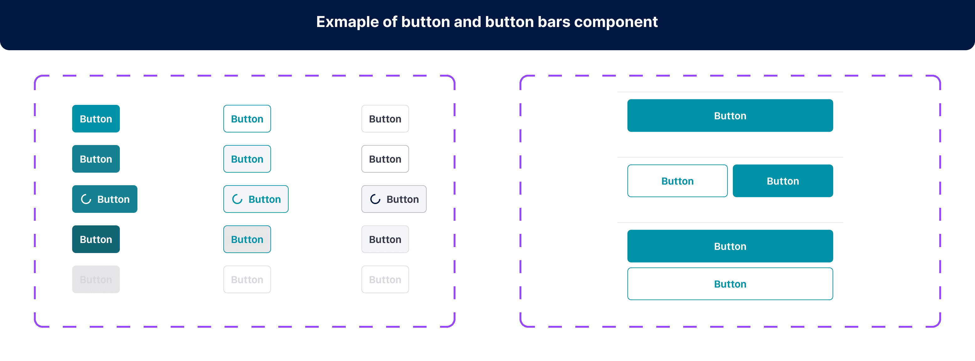
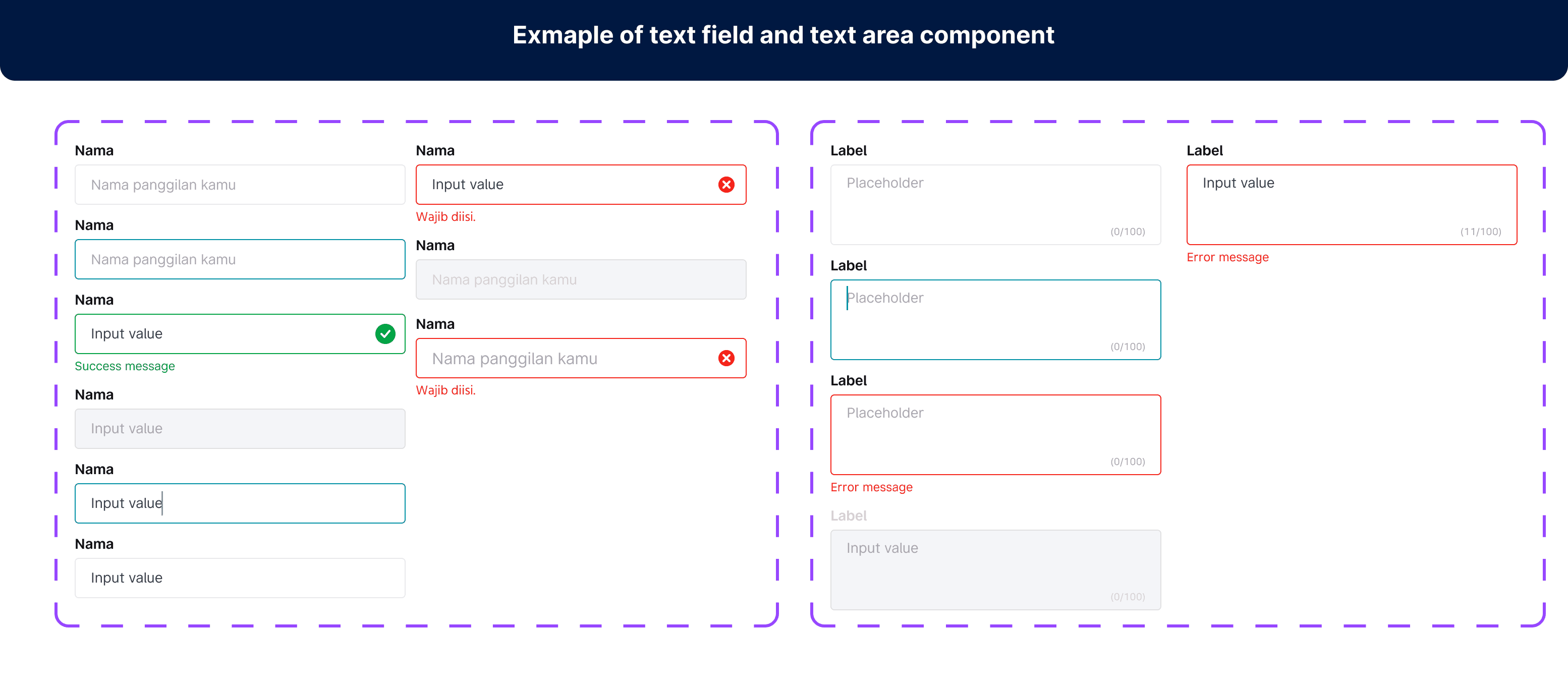
During the design audit, I organized the frequently used components in those designs. I came across approximately 70+ components (excluding variants), which I'll now create and store in our design system.
Foundations
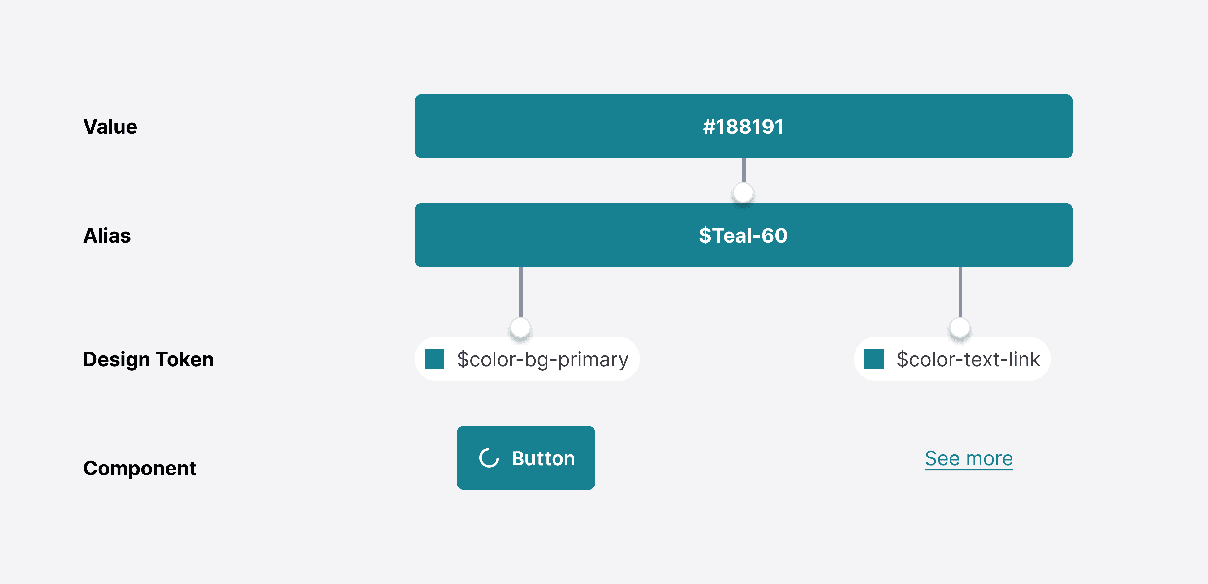
Foundation is core elements of all visual and interactive design decisions. We have several foundation elements such as color, typography, spacing, layout, sizing, shadow and corner radius. These foundation’s elements are integrated with engineering through design tokens.
Token Naming
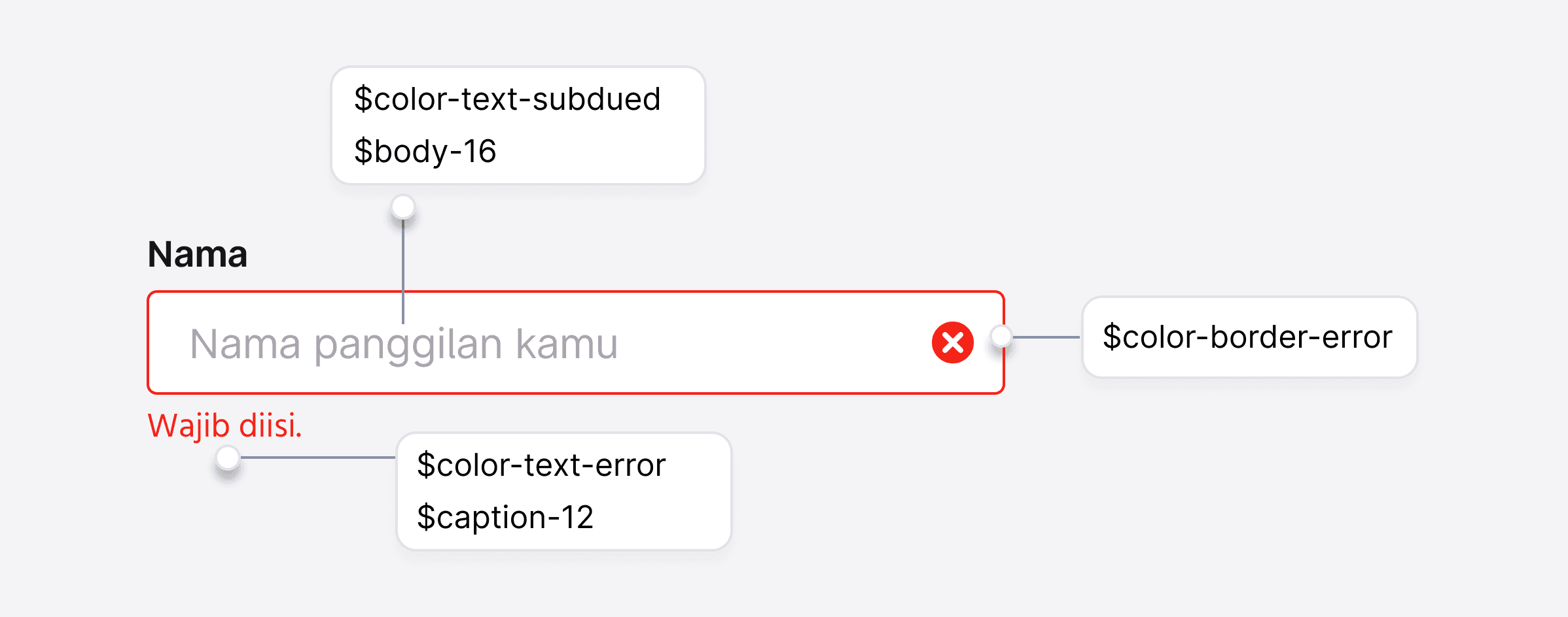
Design tokens represent fundamental decisions of Paste’s design language, specifying their intended usage with their semantic naming in a predictable and clear way. For example, $color-text-link-destructive is used for displaying link text that communicates an action is destructive. Using the appropriate token ensures that all destructive actions are styled consistently, appearing as red text in this case. Once a token name is created, it can never change, or be removed.
Tokens are named semantically to specify their intended usage. The format of a design token name is:
$type-category-instance-variant-state
$color-background-success
Do
Name a token based on its use case or purpose.
$color-background-green
Don't
Don't name a token based on its value.
The Design System
Through my efforts, I managed to assemble a total of 488 components and 109 styles, significantly improving the designing and hand-off processes for our team.Efficiency stands as a central pillar in design systems, and mine is no exception. The primary goal of this design system is to expedite asset creation by granting me access to a wealth of reusable components.
By eliminating the need to recreate basic elements from scratch, I can dedicate my time to innovation, swiftly crafting pages using purpose-built components and patterns.
Each UI component comes complete with usage guidelines and a range of variations, catering to different states and use cases. The accompanying documentation outlines available properties, empowering me to comprehend how to customize each component to suit my needs.


The Guide and Rules
As part of the process, I ensure that each design element and component receives meticulous documentation, offering clear guidance on their proper usage. Well-documented design systems serve as invaluable resources, communicating essential rules and best practices to support both designers and developers throughout the design and implementation journey. I find it beneficial to outline common use cases for each element while also highlighting how they should not be used, thereby minimizing inconsistencies in the final design.This documentation takes various forms, including comprehensive overviews, visual examples or use cases, and detailed scenario explanations. By providing ample detail on how to utilize each element and offering clarity, confusion is effectively avoided.
I've delved into Figma properties extensively, gaining insight into how components should be configured for optimal performance and visual coherence. Through meticulous documentation and visual aids, I've outlined a clear hierarchy for elements, using buttons as an example, distinguishing between primary, secondary, and tertiary variations to guide their appropriate usage. Moreover, I've placed a strong emphasis on accessibility considerations, ensuring that designs are inclusive and cater to the needs of diverse users.


The Implementation
As part of the process, I ensure that each design element and component receives meticulous documentation, offering clear guidance on their proper usage. Well-documented design systems serve as invaluable resources, communicating essential rules and best practices to support both designers and developers throughout the design and implementation journey. I find it beneficial to outline common use cases for each element while also highlighting how they should not be used, thereby minimizing inconsistencies in the final design.This documentation takes various forms, including comprehensive overviews, visual examples or use cases, and detailed scenario explanations. By providing ample detail on how to utilize each element and offering clarity, confusion is effectively avoided.
I've delved into Figma properties extensively, gaining insight into how components should be configured for optimal performance and visual coherence. Through meticulous documentation and visual aids, I've outlined a clear hierarchy for elements, using buttons as an example, distinguishing between primary, secondary, and tertiary variations to guide their appropriate usage. Moreover, I've placed a strong emphasis on accessibility considerations, ensuring that designs are inclusive and cater to the needs of diverse users.

Lesson Learn
A design system must strike a balance between consistency and flexibility to serve diverse use cases.
Documentation is as important as the design itself—it ensures adoption and consistency.
Collaboration with developers is key to ensuring the design system is implemented as intended.
Sorry 😞
This page is only availabvle on desktop at the moment